Facebook is undeniably one of the most popular social media platforms and a thriving marketplace for selling products. However, if you find yourself struggling to leverage the benefits of Facebook ads creatively to boost your sales, this blog is tailored for you! Let’s get inspiration from 12 ad creative examples on Facebook to understand what drives them to success.
Understand Facebook ad creative
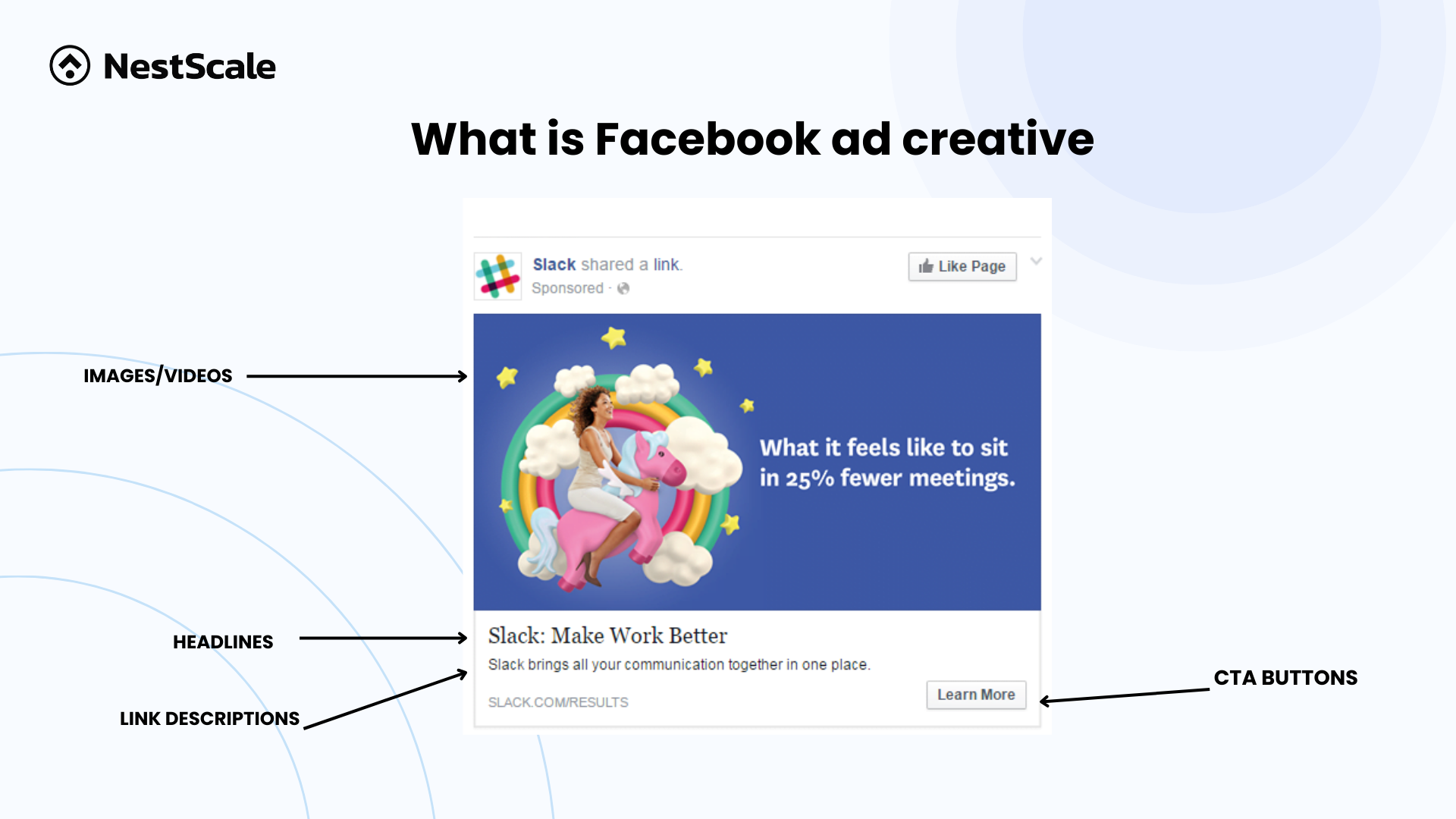
A Facebook ad creative is a visual component that encompasses advertising information, catering to various campaign objectives. Often referred to simply as an ad, it stands as a foundational element within the overall structure of Facebook advertising, as illustrated in the image below.
Four primary types of creative ads will be prevalent, encompassing image ads, video ads, carousel ads, and collection ads.
12 Facebook ad creative examples to inspire your campaign
Have you ever wondered how businesses leverage their Facebook ad creative for substantial benefits? In the next section, we’ll showcase 12 shining examples. We’ll delve into their success stories, offering valuable insights into effective Facebook advertising strategies.
Image ads
Image ads are the most popular creative type on Facebook, making it essential for businesses to plan out standout strategies to distinguish themselves from competitors. Let’s delve into how these ads achieve differentiation and capture audience attention effectively:
Nom Nom
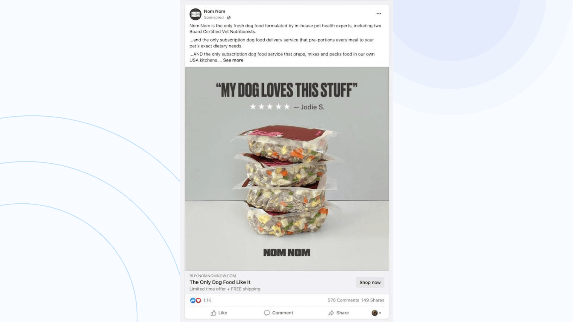
Nom Nom has made this Facebook creative image ad to advertise their dog food products. Implementing this campaign has brought back a huge rate of CPC along with fast growth in the buying rate.
How they do:
- Strategic messaging placement: Nom Nom understands that customers often skim through wordy ads. To counter this, they strategically place the crucial message, “MY DOG LOVES THIS STUFF,” in the middle of the ad image with a larger font. This ensures that even those who quickly scroll down can catch the important message.
- Customer testimonials for credibility: Nom Nom leverages the reliability of customer experiences. They feature positive feedback from a customer, including the person’s name and a 5-star rating. This not only adds credibility to their product but also emphasizes the positive experiences of real customers.
- Attractive promotions and deals: Nom Nom boosts the allure of its ad by prominently featuring promotions and deals in the ad description. By seamlessly integrating these two elements, the creative ad becomes markedly more enticing, consequently driving up the click rate. This strategic approach effectively taps into consumer cravings for value and savings, rendering the product even more irresistible to potential customers.
Project Repat
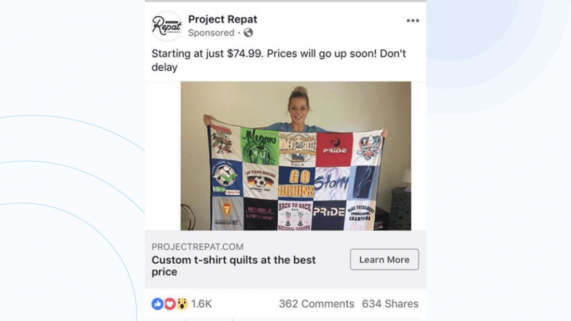
Project Repat has carried an image Facebook ad to announce their custom products. This campaign quickly attracted many people and impressions were seen through the like, share, and comment rates.
How they do:
- Creating urgency with limited-time pricing: Project Repat effectively taps into the psychology of urgency by highlighting a great price while emphasizing that it’s not a fixed rate. By conveying that this favorable pricing is temporary, they encourage customers to take prompt action, capitalizing on the fear of missing out on a good deal.
- UGC content for endless creativity: Project Repat embraces user-generated content (UGC) as a key strategy. By encouraging customers to become content creators through the process of making their products, they ensure a continuous stream of diverse and authentic content. This not only engages the customers but also provides an ever-growing library of content for marketing purposes.
- Simplicity as a strength: Project Repat understands the power of simplicity. Instead of using flashy and colorful posts, they opt for a straightforward approach. The image ad focuses on demonstrating how their product will look, prioritizing clarity over complexity. This simplicity can resonate well with customers, delivering a clear and concise message about the product and its benefits.
Lume deodorant
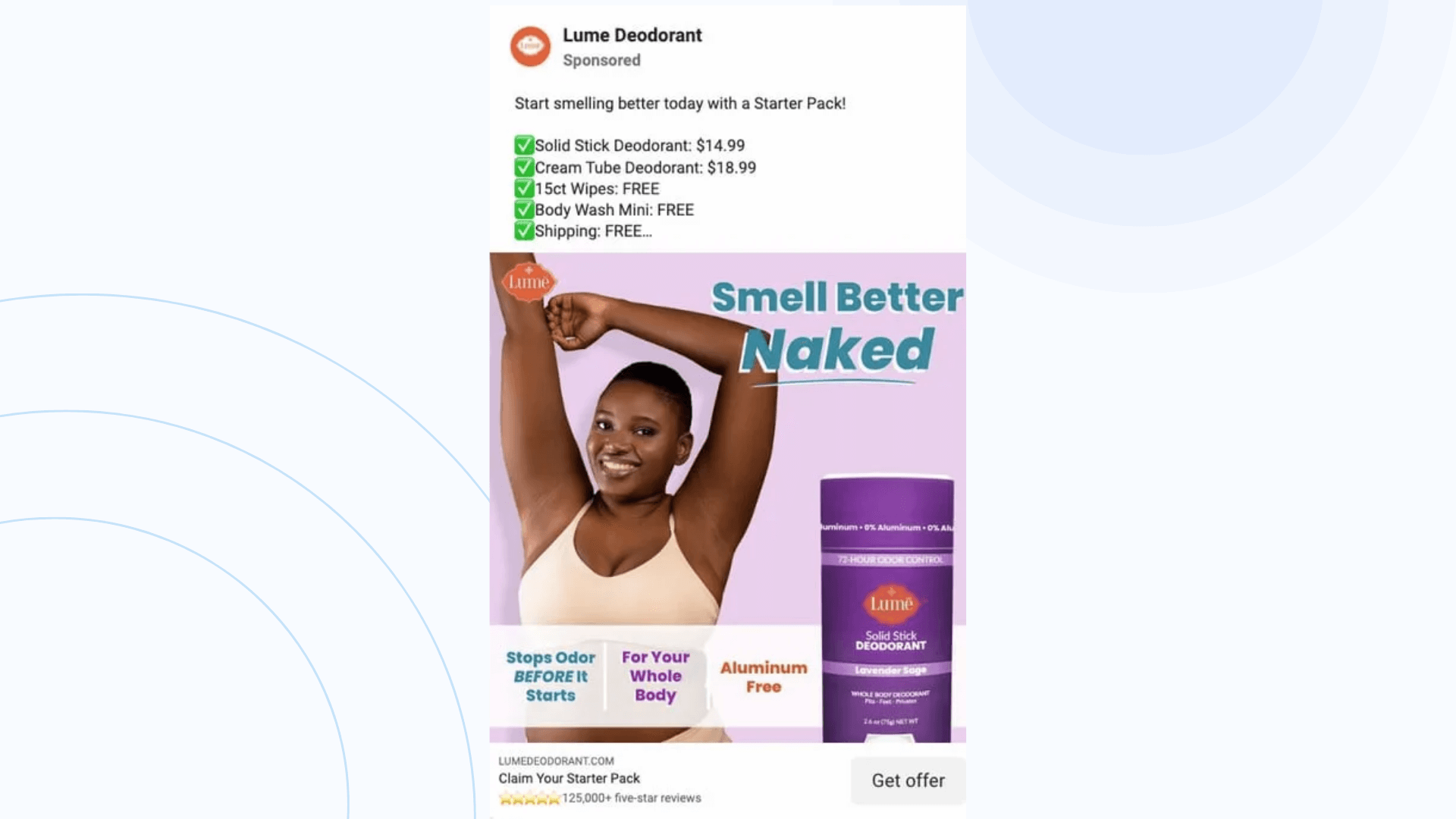
Lume deodorant sells a typical product which raises the question of how to promote it but not make it too sensitive to look at. However, they were successful in this game. Let’s see what they have done:
How they do:
- Strategic visual arrangement: This Facebook ad campaign excels in visual arrangement. The image showcases the product, its ingredients, practical uses, and a before-and-after comparison featuring a model who has used the product. The color scheme is chosen to be aesthetically pleasing, creating a visually cohesive and engaging image that captures the customer’s attention.
- Text utilization for clarity: The ad text is strategically crafted to convey vital information succinctly, avoiding overwhelming the viewer. Bullet points are strategically utilized to accentuate the product’s key features and its price, facilitating quick comprehension for customers. Moreover, the strategic inclusion of the word “FREE” instills a sense of value and urgency, compelling potential customers to take immediate action.
- Clear and compelling CTA: The Call-to-Action (CTA) is a crucial element in any ad, and Lume deodorant nails it with the phrase “Get Offer.” By appealing to the customer’s desire for a good deal, this CTA catches attention and generates curiosity. The strategic use of words plays on the psychology of consumers, making them more likely to click and explore the offer, ultimately driving sales for the business.
Video ads
If you’re seeking examples of video ads to reference, we’ve curated a collection of shining examples that exemplify creativity and effectiveness in engaging audiences. Let’s check!
Kay Jewelers
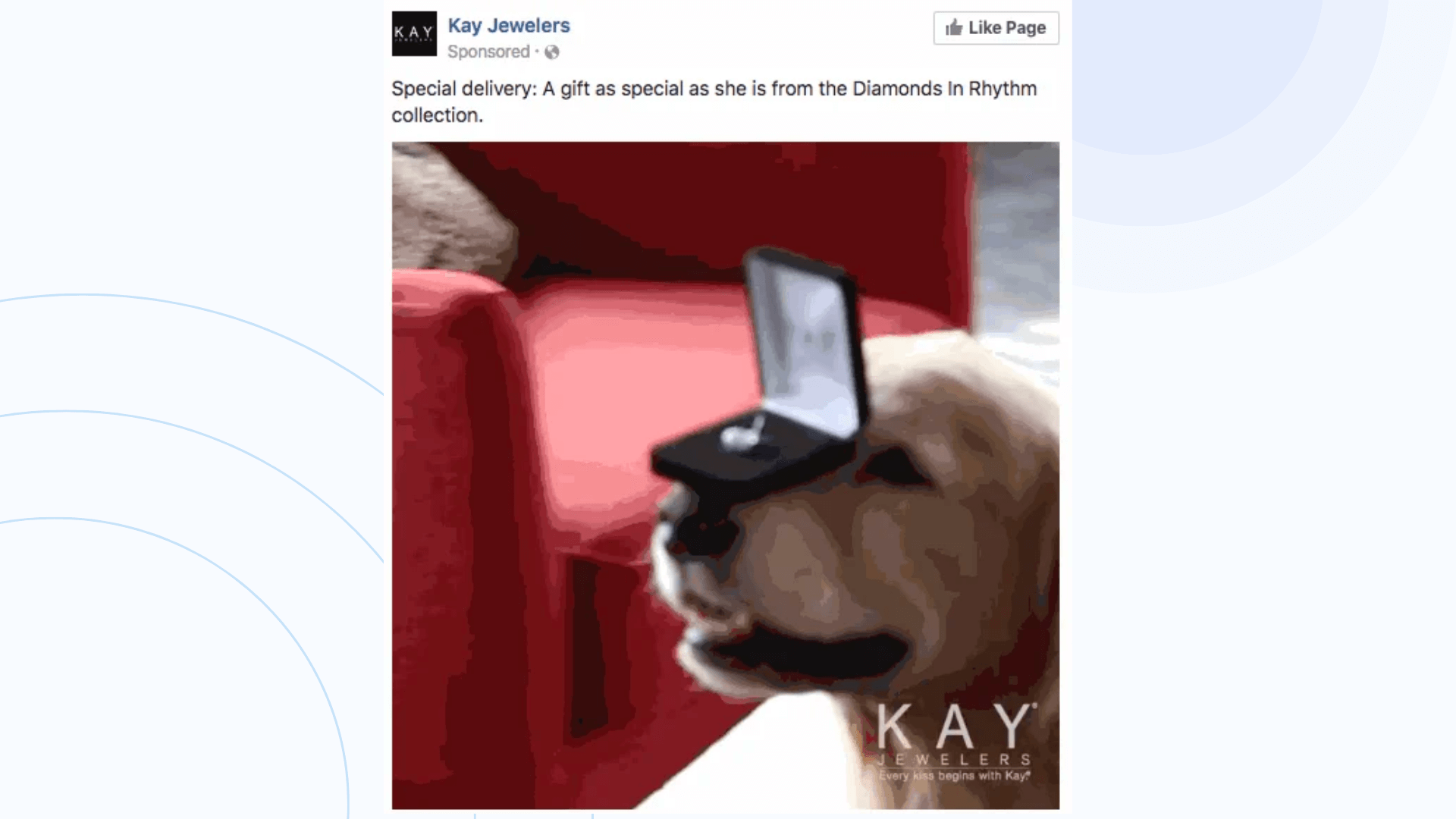
Key Jewelers – a jewelry business made a video ad to upsell their new collection. This campaign has brought a huge number of impressions. Brand awareness was rapidly raised via this campaign.
How they do:
- Visual matters: Even with the absence of sound, viewers can grasp the essence of this video thanks to the initial screen capture, providing a preview of what to expect. As a result, even before turning on the sound, customers already have a broad understanding of the content. This aspect is crucial considering that a majority of users tend to watch videos without audio
- Relevancy: In the first stage, the image of the product appears. Despite the flow of this story, the new collection still caught the spotlight and was centered in this video ad. Therefore, this ad still parallels the message it conveys
- Solid CTA: Key Jewelers opt for a straightforward CTA phrase, simply prompting users to “Like page.” As a result, this clear and concise call to action facilitates audience engagement, ensuring a seamless action process. By prioritizing simplicity, they yield favorable outcomes, driving user interaction effectively.
Allbirds
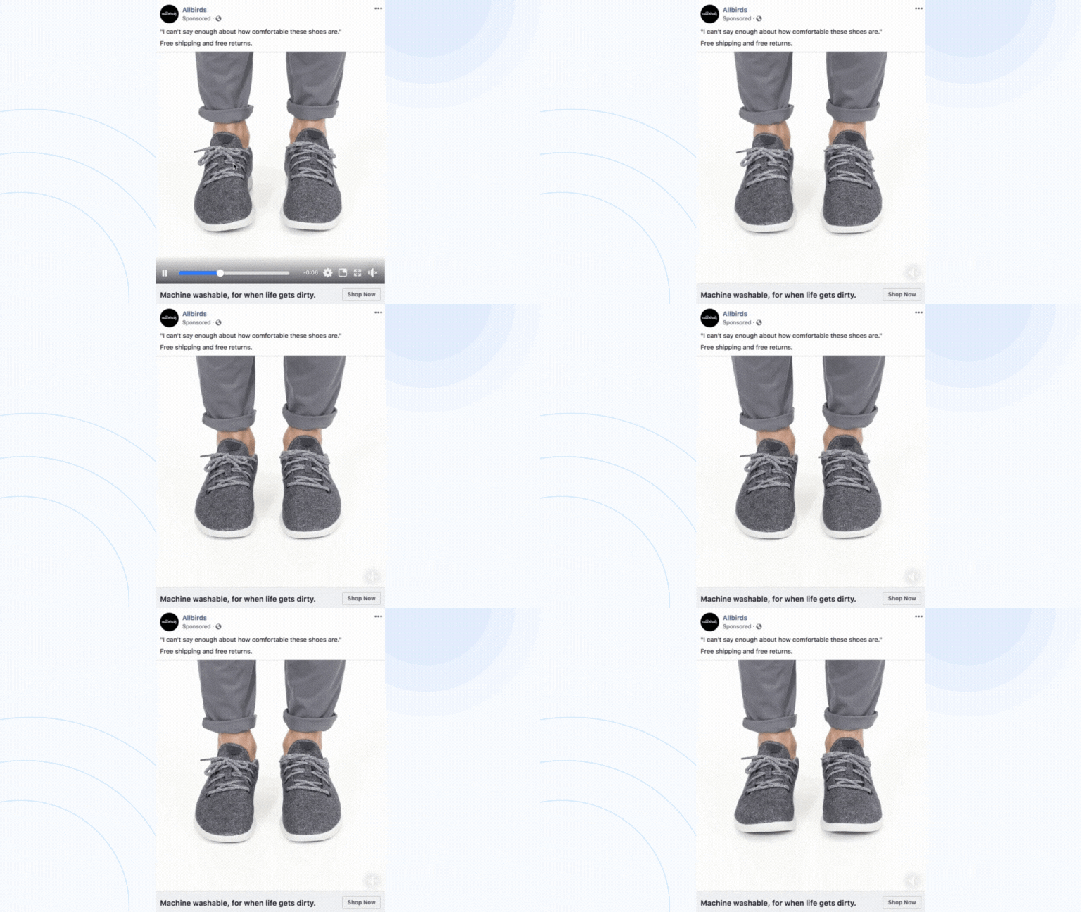
To announce a new collection of shoes, Allbirds – a shoe manufacturer business has designed a wonderful video ad praised by other marketers. What’s behind their success?
How they do:
- Highlighting visuals: Allbirds goes straightforwardly to show what they want to advertise: a pair of shoes. In the whole shot, the shoe images were always placed centrally with a huge focus.
- Offering: Customers would be impressed by the offer they got from Allbirds: free shipping plus free returning. Thinking of earning a bargain pushes them to process the next move.
- Engaging description: Description is what customers often look at when searching for a product to see what are the features of this product. By highlighting the prominent feature of this new collection of shoes, Allbirds has won customers’ hearts. No one will refuse machine-washable shoes, right?
Mailchimp
Mailchimp distinguishes itself with its unique selling proposition (USP), providing marketers with swift and uncomplicated templates. This empowers them to effortlessly craft ads and personalized messages within minutes. Mailchimp effectively communicates this key feature through a series of succinct video ads.

How they do:
- Using limited elements: Set against a predominantly yellow backdrop, the video aims to evoke a minimalist ambiance, mirroring the simplicity and ease that Mailchimp offers to its users.
- Brand logo: This video was designed to be short, and simple, so MailChimp has put their logo to this video to ensure despite customers scrolling their ads, there was a point to bear in their mind. This was an excellent strategy to grab customer’s attention.
Carousel ads
Let’s delve into an exploration of how various businesses leverage carousel ads to captivate and win over the hearts of their customers.
Profitroom
Profitroom has successfully crafted a carousel ad. Take a look at this slideshow ad and identify what makes them special.
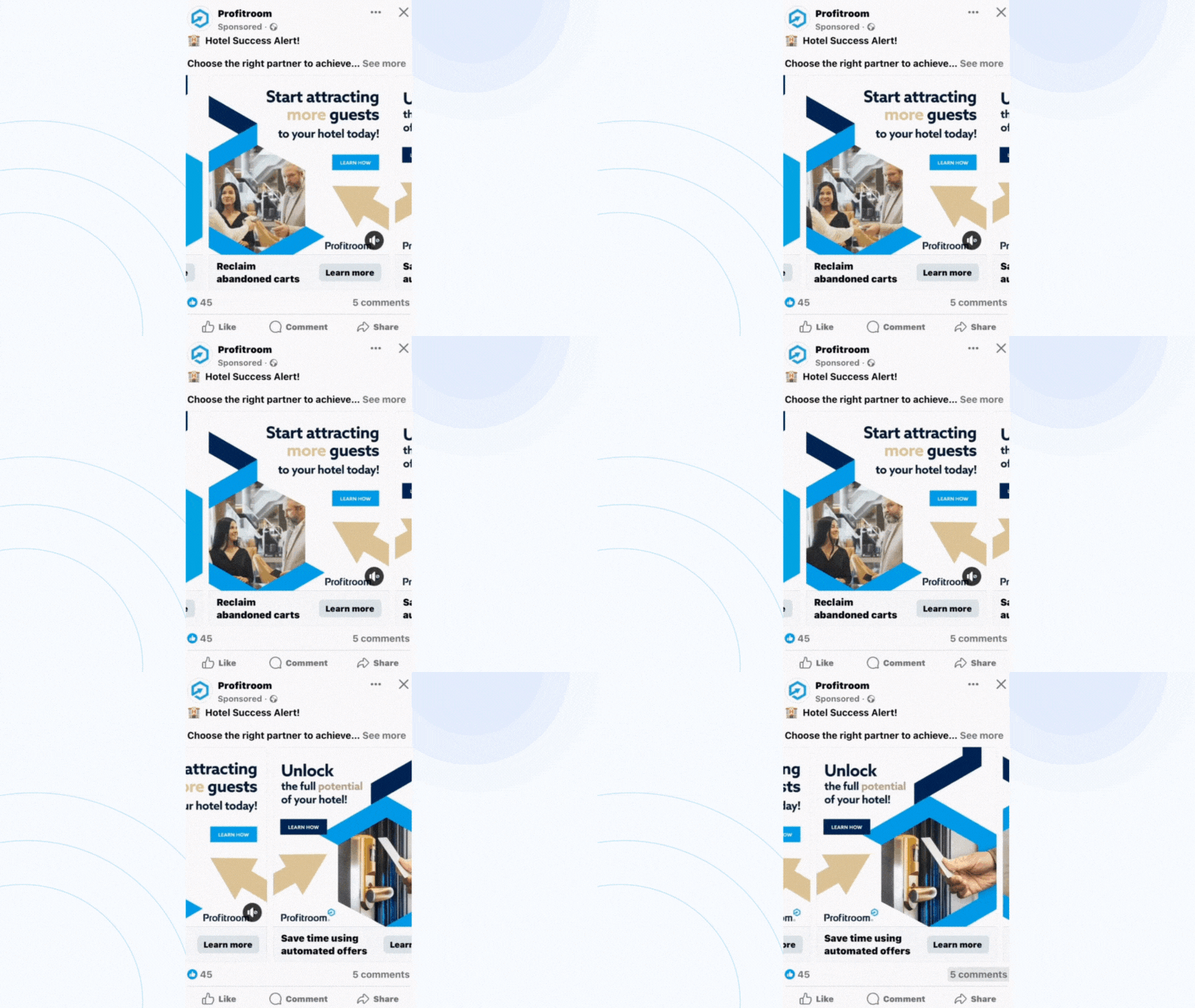
How they do:
- Aesthetic unity: The use of hexagonal design not only grabs attention but also preserves a unified brand aesthetic. The incorporation of a mix of illustrations and video content within the carousel adds a dynamic dimension, contributing to its visual appeal.
- Sequential benefit messaging: Each slide within the carousel corresponds to a distinct moment in the hotel industry, accompanied by text highlighting specific benefits. This sequential messaging strategy ensures that viewers receive a comprehensive understanding of various advantages, thereby strengthening the overall value proposition.
- Subtle Call-to-Action (CTA): The soft and consistent inclusion of “Learn how” on every creative encourages viewers to delve deeper into understanding the showcased benefits. This approach subtly invites engagement without coming across as overly assertive, providing a gentle nudge for further exploration.
YUDU Rugs
YUDU Rugs, a prominent carpet manufacturer in Africa, introduces an innovative online rug builder platform, empowering customers to design and customize their rugs. The carousel ad campaign is strategically designed to leave a lasting impression and potentially achieve a favorable Cost-per-click (CPC) rate. Here’s an analysis of why this campaign is likely to be impactful:
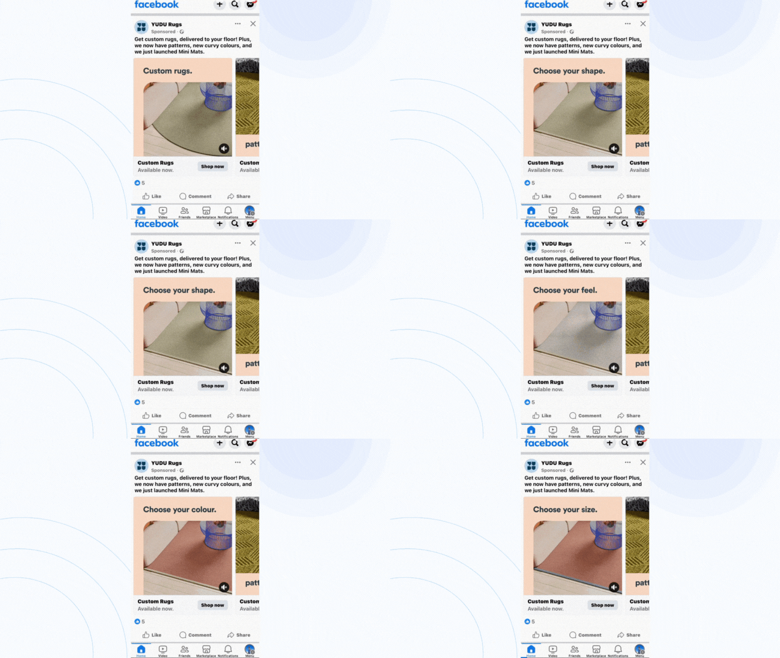
- The visual element of customization focusing: The focal video slide within the carousel vividly highlights the customization aspect. By doing this, they showcase a rug undergoing transformative changes. These alterations include altering color, shape, size, and edging. YUDU Rugs masterfully communicates the diverse range of personalized options on offer. This immersive visual journey breathes life into the customization process. It renders it palpable and engaging for the viewer.
- Simplicity generation: Go against the rest who use many elements to highlight their products (but sometimes puzzle customers with them!), YUDU Rugs focus on what they sell: the carpet. Slideshow how your house will be changed by using different color carpet, this business doesn’t speak out but lets customers see the differences, encouraging them to buy.
Chubbies
Chubbies, a distinctive clothing brand renowned for its bold and iconic men’s short shorts, has recently crafted a remarkable carousel ad that further solidifies its unique identity in the fashion landscape.
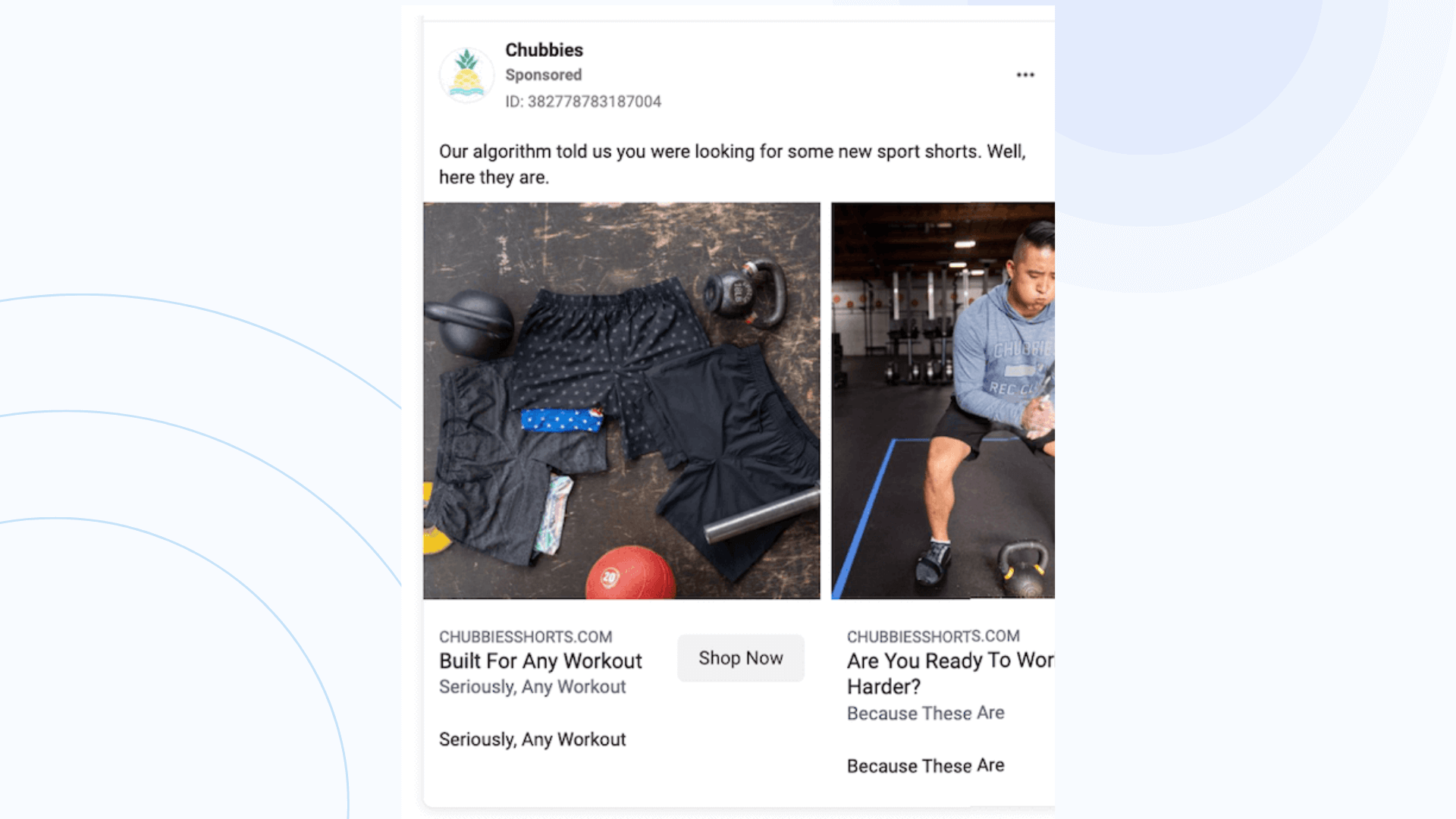
- Customer testimonials for credibility: Incorporate genuine customer reviews directly into the ad creative or primary text to build trust and showcase positive experiences with the product.
- Short, witty ad copy: Experiment with brief and clever ad copy that sparks curiosity. Moreover, they craft a message that intrigues even those outside the target audience, encouraging them to visit the website for a unique and engaging experience.
- Transparency through algorithm insights: Embrace transparency by adopting a direct and honest approach in your ad copy. Utilize phrases such as “Our algorithm informed us” to convey authenticity and openness about the decision-making process behind the product or service, fostering trust and credibility with your audience.
Collection ads
Let’s delve into the hidden factors contributing to the remarkable success of collection ads, illuminated by an exceptional example that vividly illustrates their effectiveness.
Dollar Shave Club
Dollar Shave Club (DSC) has historically been recognized for its effective marketing strategies, especially on platforms like Facebook. They have consistently utilized engaging collection ads to attract and retain customers.
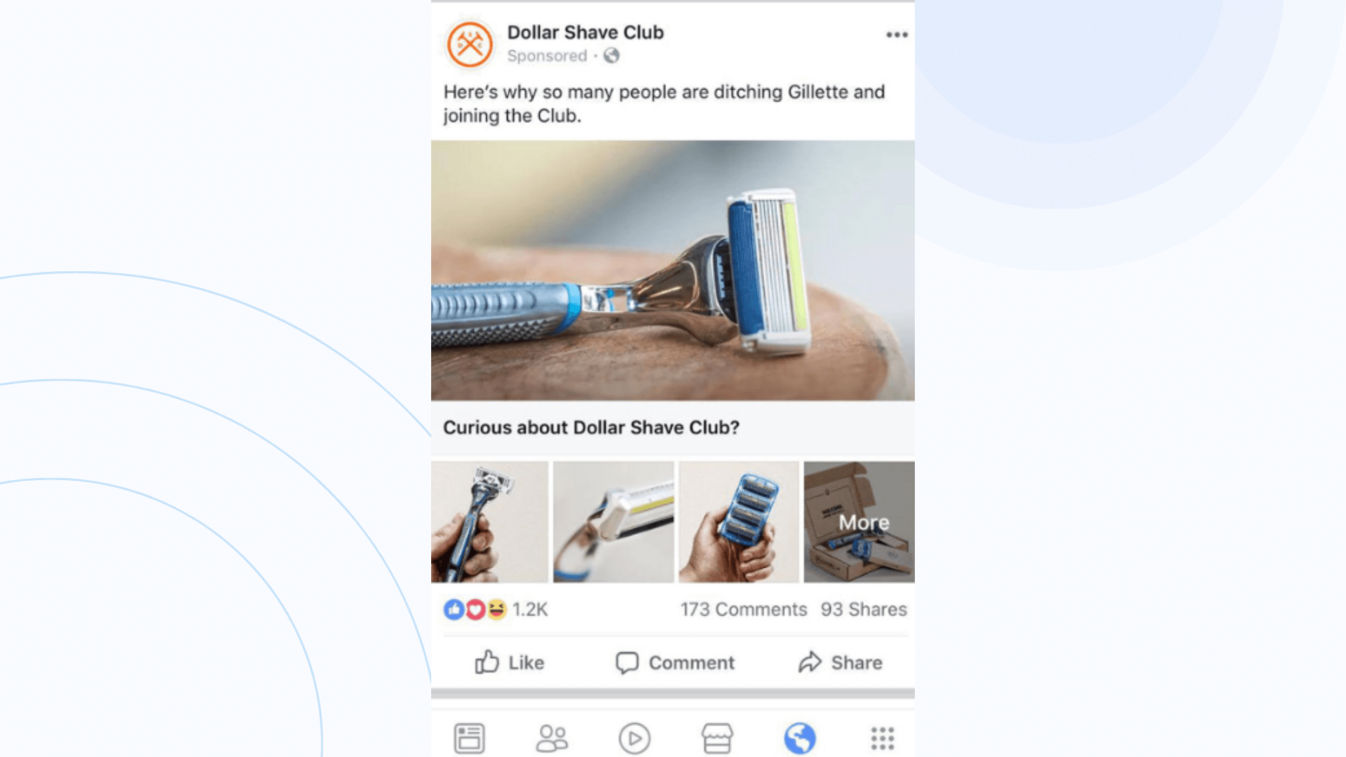
How they do:
- Embracing inclusive brand values: This action not only attracts exclusive attention from your audience but also contributes to societal benefits simultaneously.
- Offering: This brand offers customers a great deal succinctly through a brief description.
GameStop
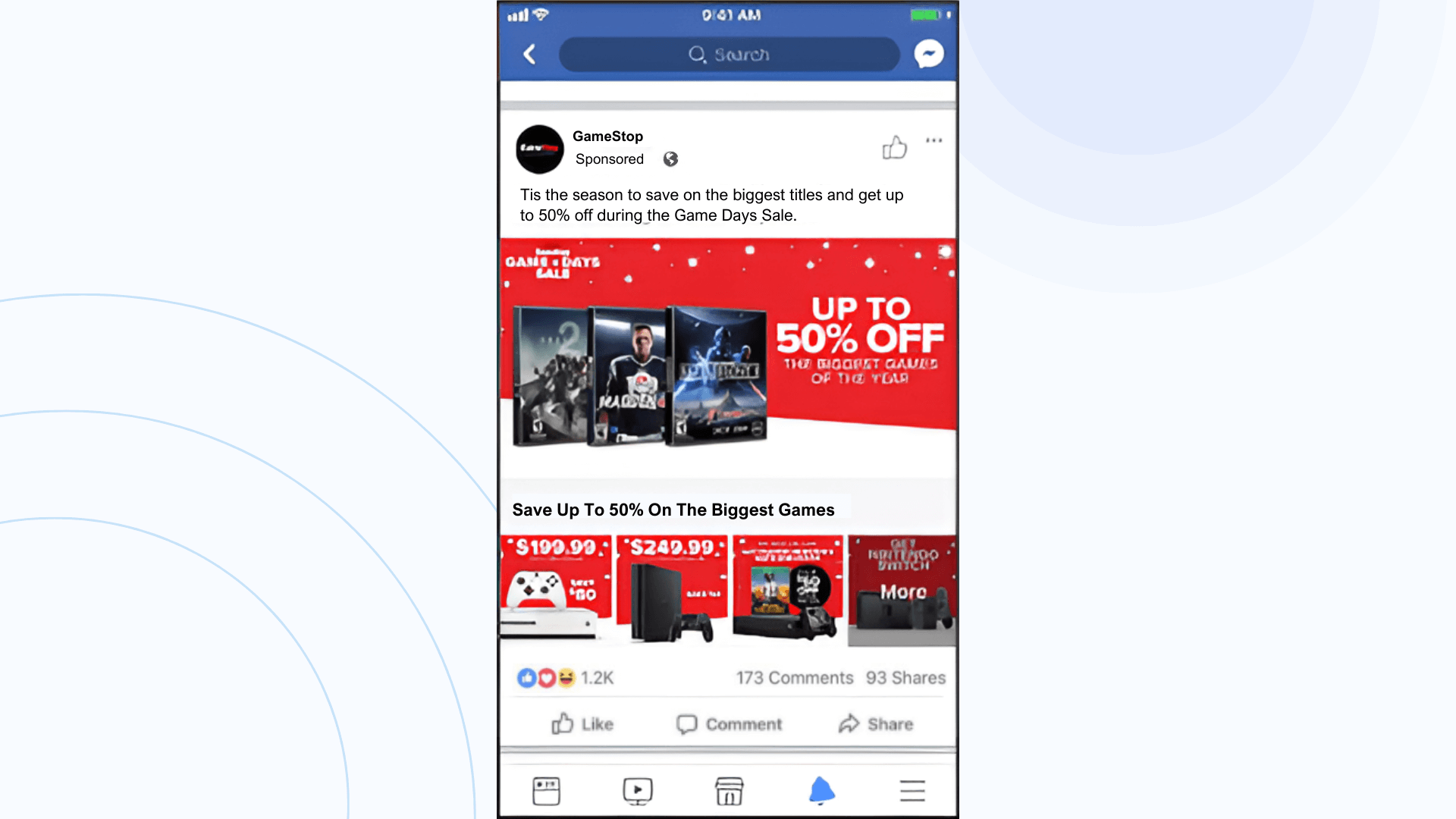
To boost both online and in-store product sales during the bustling holiday shopping season, GameStop embarked on a campaign aimed at capturing shoppers’ attention and highlighting multiple game products. They executed a series of six captivating collection ads centered around their holiday “Game Days Sale.”
How they do:
- Emphasizing the discount rate: GameStop employs numerical values to vividly illustrate the substantial savings customers can enjoy during the sale season.
- Utilizing visuals effectively: GameStop employs a red color scheme as a backdrop and prominently showcases its products on screen, providing customers with a visually engaging browsing experience and facilitating an intuitive purchasing process.
Adore Me
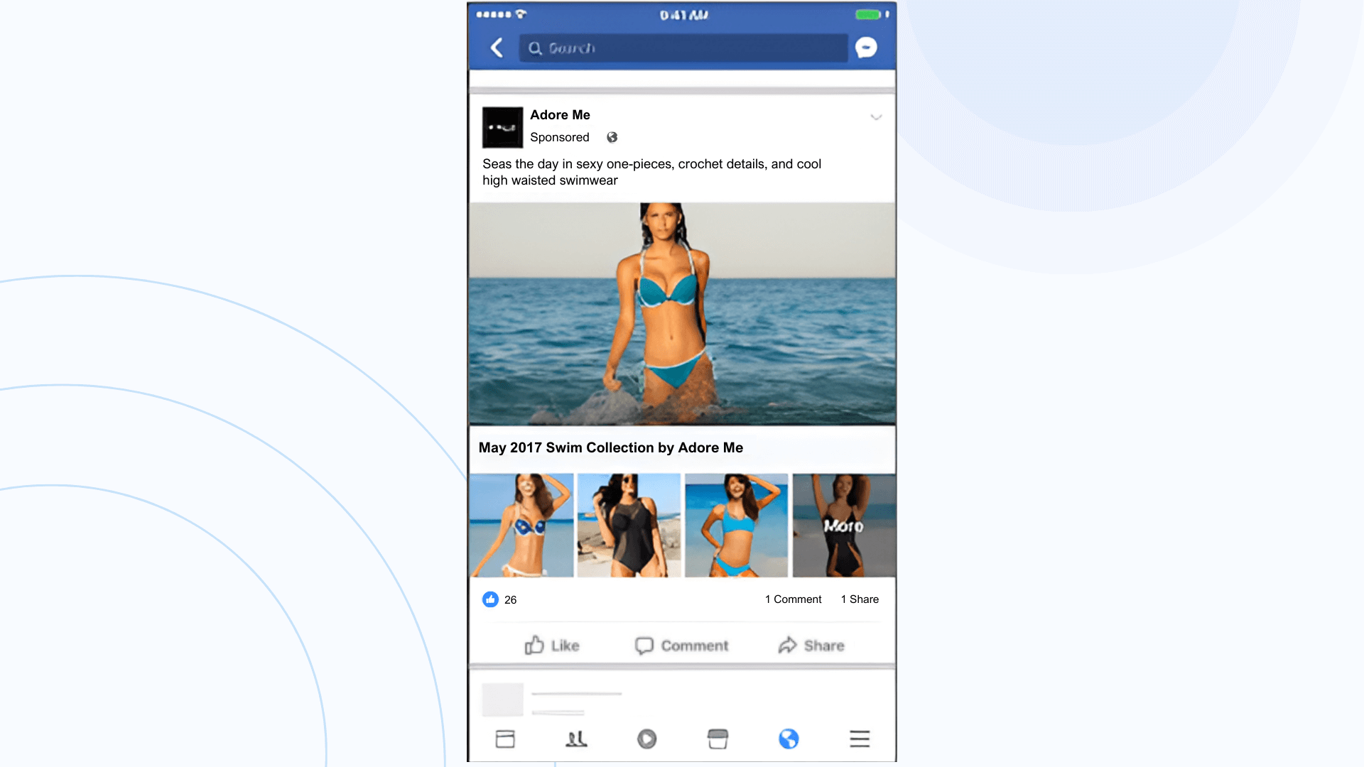
Following a year-long break from Facebook advertising, Adore Me made a triumphant return with a revamped strategy. This business utilizes the collection ad format to spotlight its latest swimwear line and drive online sales of the 2017 collection.
How they do:
- Displaying products prominently: Adore Me selected a lifestyle cover image featuring a lively woman donning a vibrant bikini, complemented by smaller thumbnails showcasing additional pieces from their spring and summer collection. Thus, this approach effectively underscores the brand’s diverse array of offerings.
- Emphasizing simplicity: Adore Me adopts a straightforward approach to showcasing its collection, instilling a sense of trust among customers. By presenting their products in a clear and uncomplicated manner, Adore Me enhances the likelihood of customers clicking and making purchases.
What to learn from these Facebook ad creative examples?
We have introduced you to 12 shining examples of Facebook ad creative. Here are the tips we’ve gathered for you to maximize your sales through these types of ads
- Visual appeal and consistency: Ensure that your ad has a visually appealing design that aligns with your brand’s identity. Use high-quality images or videos that capture attention quickly as users scroll through their feeds.
- Clear and compelling messaging: Craft concise and compelling messaging that communicates the unique selling points of your product or service. Incorporate a clear call-to-action (CTA) that guides viewers on the next steps, whether it’s making a purchase, signing up, or visiting your website.
- Audience targeting and personalization: Utilize Facebook’s robust targeting options to reach the most relevant audience for your product or service. Tailor your ad content to speak directly to the needs and interests of your target demographic.
NestAds offers a solution designed for this comprehensive analysis: the Creative Report. With NestAds’ Creative Report, you can see how each of your creatives is performing, understand how they contribute to your store’s revenue, and determine which content patterns could be optimized further for other creatives or even for retargeting ads. Get ready to take the performance of your ads to the next level with NestAds’ Creative Report!
