In online commerce, where each click carries immense significance, leveraging Google Display Ads can be a game-changer for your business. Yet, many struggle to harness their full potential. How can you ensure your ads target the right audience and perform optimally? What elements are essential to captivate attention? And, crucially, how do you craft ads that drive conversions and prompt purchases? Addressing these challenges begins with creating compelling ads that immediately catch the eye. So today, we’re unveiling the top 16 Google Display Ads examples.
Learn from these examples, draw inspiration, and elevate your ads to drive greater sales in the future. Don’t delay—let’s dive in!
What are Google Display ads and how to use them?
Google Display Ads are crucial in boosting brand recognition and offering widespread visibility. These ads are featured across a massive network of over 2 million websites, apps, and videos known as the Google Display Network (GDN). They effectively deliver advertising content to a diverse audience across various online platforms, solidifying their significance in digital advertising.
This versatile ad format includes responsive display ads, banners, lightbox ads, native ads, and videos.
- Banner ads: Traditional display ads in various sizes are placed on web pages.
- Lightbox ads: Clicking on a standard banner ad leads to a captivating overlay expanding on top of the website content instead of redirecting to a new page.
- Native ads: Blend seamlessly with content for a non-intrusive experience.
- Videos: Google Video Ads are a form of online display advertising that utilizes video to reach customers. These videos can appear on YouTube, partner websites, and apps affiliated with Google.
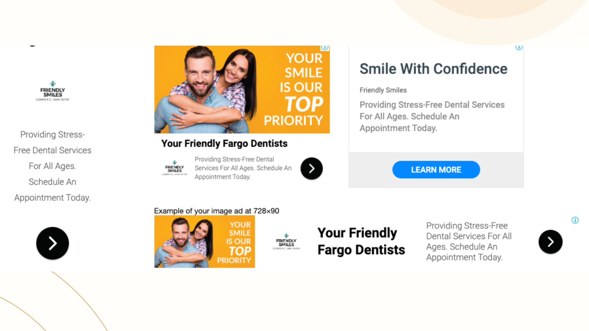
- Responsive display ads: Which are often preferred for their versatility, allow the upload of various assets like images, headlines, logos, videos, and descriptions. This Google Display ad adapts assets to create variations for websites, apps, YouTube, and Gmail, targeting diverse audiences and placements. Next, I’ll show you a sample:
16 best Google Display ads examples
To optimize your Google Display Ads and get the optimal result you want, firstly, your ads need to include creative visuals and fascinating content. What will it look like? Here are some Display Ads examples from Google for you to follow:
Disney +
Despite working in film generation for over 90 years, on celebration events for launching the new Disney+ streaming service, Disney+ has run a wide range of Google Display Ads to message out.

Reason for success:
- Using well-known characters: This ad effectively captures users’ attention by featuring some of Disney’s most beloved and recognizable characters at the top. Although Disney didn’t originally create Star Wars or Captain America, they do own the rights to these iconic franchises, a detail that keen observers may notice
- Using well-known brand logos: The Disney logo has been placed clearly in the middle along with other logos from Disney brands such as Marvel or Pixar,…They collaboratively work to gather all attention from customers when giving them ideas of what will be shown
- Providing a clear call-to-action button: Disney aims to show the free offer to customers and they highlight it at the bottom by phrasing out “Start free try” to persuade them to action
APPLE
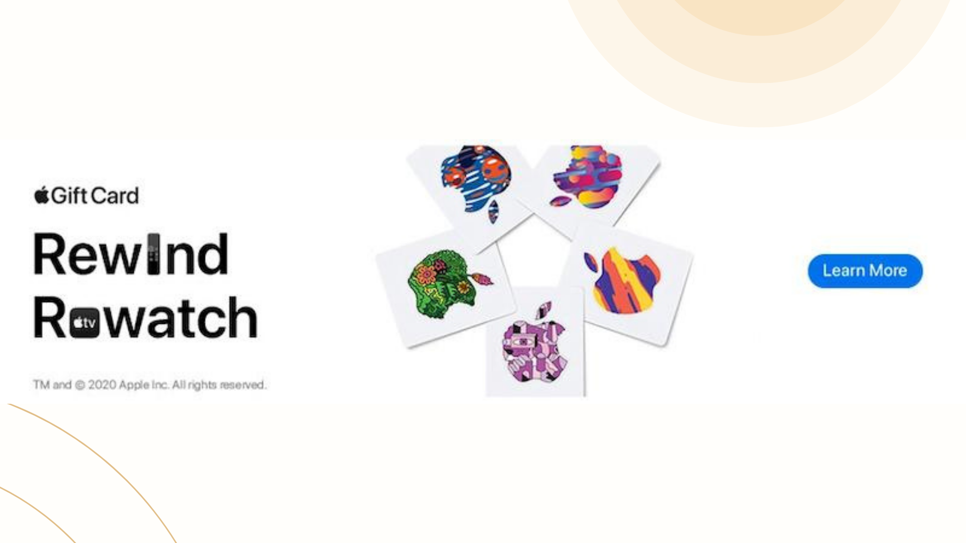
When making Google Display Ads runs for the release of GiftCard, Apple has shown its experience in grabbing people’s attention and sales conversions.
Reason for success:
- Leveraging brand imagery: Google adeptly capitalizes on the iconic bitten apple, effectively positioning it at the center of the ad to signify that it’s an announcement from Apple, leveraging the brand’s recognition and identity.
- Using relevant icons: The inclusion of the remote and Apple TV icons effectively communicates Apple’s focus in this campaign, aligning with the trend of staying at home and enjoying movies, mirroring the shift from theaters to home entertainment.
- Placing a strategic CTA: While the call to action “Learn more” might lack some compelling elements, its high-contrast blue color stands out, contributing to the overall strength of the ad’s design and placement.
HIRMER
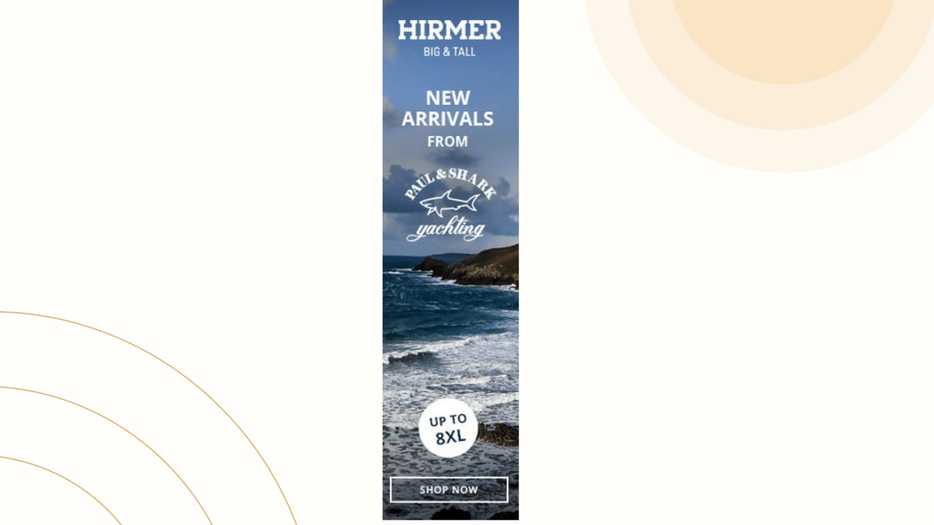
HIRMER, a brand specializing in plus-size clothing, may not enjoy widespread recognition, given its focus on a specific audience. Despite this niche appeal, the company has effectively executed numerous successful display ad campaigns. An illustrative example is their adept use of Google Display Ads banners, seamlessly integrating with the Google Display Network’s websites. They achieved this by employing neutral-colored images that blend perfectly with sites in GDN while still effectively conveying their message to initial viewers. Let’s delve into the details of how they accomplished this:
Reason for success:
- Using excellent imagery: The most captivating element of this ad is the stunning imagery of beaches. The beautiful background is highly effective and guarantees attention, irrespective of the website where it appears.
- Presenting clear product description: The text in the ad effectively communicates the brand’s offerings. Phrases like “big & tall” and “new arrivals” make it clear that they are a clothing store. Without this specific copy, someone scrolling through might mistakenly think they are selling vacations or travel-related items.
- Stating strong call to action: Rather than a generic “learn more” call to action, the ad specifically prompts action with “shop now,” a subtle yet impactful difference.
SE ranking
SE Ranking focuses on rank tracking and aids marketers in comprehending the effectiveness of their SEO endeavors. The use of display ads has significantly contributed to enhancing SE Ranking’s brand visibility and recognition.

Reason for success:
- Offering relevant copy and headliners: The headline effectively communicates the brand’s service, clearly stating what they do. While they could have used a straightforward “keyword rank tracker,” adding “100% accurate” significantly captures the user’s attention. This detail resonates with users seeking these tools, as accuracy is their primary desire.
- Listing the main features: The advertisement highlights its software’s standout features that intrigue marketers. While numerous trackers focus on Google, not all include Yahoo, Bing, or YouTube.This distinction highlights a crucial aspect that differentiates their software from others in the market.
- Making huge CTA and specific information: The size of the CTA button accounts for ⅓ of the ad image with clear information provided: they will offer 14 for a trial before customers choose any paid plan to subscript.
Geico
This display ad leverages Geico brand for car insurance to introduce and promote its home insurance policy. While Geico is well-known for car insurance, this ad aims to capitalize on its existing brand awareness to emphasize a better, more affordable insurance policy that covers both car and home.

Reason for success:
- Boosting brand awareness with icons and images: Geico makes use of a car image when putting it in the middle of the product listing circle. Moreover, when they aim to boost more sales with home insurance, the house icon is put next to car insurance
- Utilizing color contrast: Smart use of color brings attention to the images and headlines, making them stand out and catch your eye.
Harry’s
Harry’s, a razor subscription service, offers the convenience of delivering high-quality blades directly to your doorstep every month, eliminating the need to visit a store. Through running display ads, Harry’s efficiently targets their audience, contrasting with competitors who invest significant sums in non-targeted TV advertisements. This strategic approach allows Harry’s to effectively reach their intended market and optimize their advertising budget for better returns.

Reason for success:
- Simple design to show off the product: They directly what they will sell with a clear headliner.
- Being excellent for remarketing: Seeing this ad for the first time might leave users thinking “Who are they?” or “What do they do?”. But if the user has already visited their website, this is a great follow-up ad that reminds users of what they sell.
- Providing a huge and compelling CTA button: Getting someone to sign up for a free trial is always a better option than just sending someone to a store and hoping they buy something. That’s why this orange redeems trial button has a much stronger call to action than just “shop now”.
Honey
Honey is an online plugin designed to assist users in locating the best discount coupons or codes for various stores. With a simple click, it automatically tests multiple coupons to ensure users obtain the most favorable price. To enhance their brand recognition and encourage more downloads and usage of their plugin, Honey has launched a series of display ad campaigns. These campaigns aim to raise awareness about the plugin’s capabilities and attract more users by highlighting its money-saving features.

Reason for success:
- Offering a straightforward headliner: The headliner informs customers what they will sell/customers may get from their business. It’s such a good way to touch the pain point.
- Making use of feature image: Honey has collaborated with the YouTube sensation MrBeast on multiple occasions, significantly contributing to their recent growth. For many, hearing about Honey is often linked to MrBeast.
Using his image triggers memories of Honey, possibly through MrBeast’s association, fostering brand familiarity. - Being vague enough to target anyone: Viewers grasp the message, possibly prompting action. Simplicity in this case works best.
Watchfinder & Co.
Watchfinder & Co. specializes in pre-owned luxury watches like Rolex and Breitling. They focus on buying watches from individuals, intending to resell them later. This specific aspect is highlighted in their ads to encourage sellers’ engagement.

Reason for success:
- Providing a clear headliner: The headline promises instant part exchange and quotes for watches. “Today” emphasizes the process’s promptness, assuring swift transactions
- Using a large image to grab attention: The ad showcases a luxury watch, aligning with Watchfinder & Co’s acquisition goals. Featuring a recognizable brand enhances relatability, potentially boosting engagement.
- Using a bold and contrasting call to action button: The CTA button is designed with different colors making it more outstanding and easy to see.
Bluehost
Bluehost, a web hosting service established in 2003, boasts hosting over 2 million websites. Given the highly competitive landscape of web hosting in search results, Bluehost has opted to complement its existing marketing strategies by utilizing display ad campaigns. This move allows them to expand their reach and potentially capture the attention of a broader audience beyond traditional search engine results.

Reason for success:
- Showcasing their low price: Customers seem to make a purchase when they see a low price. Bluehost catches this idea when forming their Google ad
- Listing important features: After catching users’ attention, the ad highlights its main features below the headline, such as “unlimited space & transfer.” These features serve as a showcase for Bluehost’s services, elucidating to users the reasons behind the service’s quality and highlighting why they stand out in the market.
- Capitalizing important note: The enticing offers of a “FREE set-up” and a “FREE domain” are certain to further capture the user’s interest, potentially increasing the likelihood of them clicking the CTA button “sign up.” These free offerings serve as additional incentives, encouraging users to take action and explore the service further.
Urban
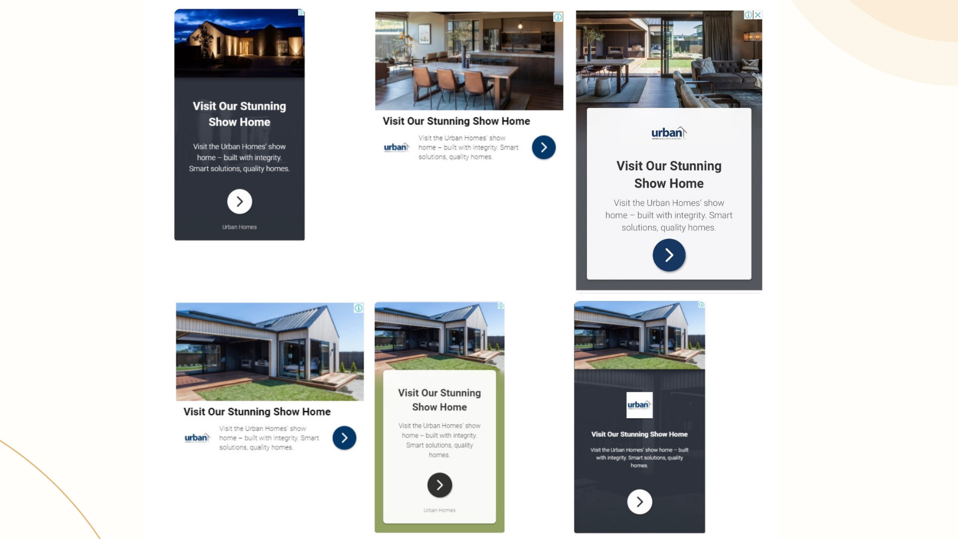
Urban invite people to experience exceptional craftsmanship and attention to detail in their show homes. They have run a Responsive Google Display Ads example to show their product and boost sales.
Reason for success:
- Crafting a visual representation: The ad employs an image to display its offerings, aiding viewers in visualizing the provided product or service. This helps them better understand what’s available. Additionally, the inclusion of their logo strategically brands the advertisement, enhancing recognition.
- Delivering a concise headline: Urban Homes delivers their value proposition through a concise headline, offering customers immediate insight without requiring website navigation. This saves customers time and effort.
Adobe
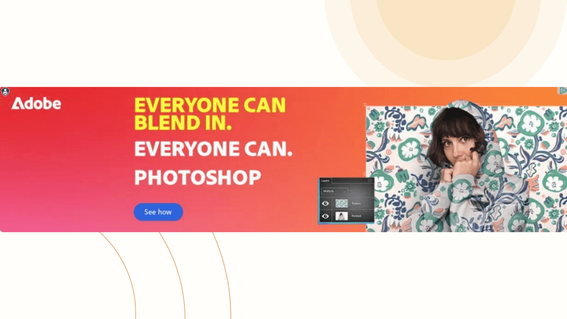
Adobe strengthened its presence with Google display ads to promote its new blending tool. The brand has strategically used an appealing banner to enhance its visibility and engage a broader audience.
Reasons for success:
- Attractive tagline: Adobe ensures their taglines are clear and straightforward to capture viewers’ attention instantly. The taglines directly highlight the unique points of Adobe’s products, particularly emphasizing the user-friendliness of their blending tools.
- Clear CTA: Adobe effectively utilizes clear CTAs to capture new customers’ attention and prompt them to click on banners. The CTA content is simple, yet triggers customers to take action and explore the tool for themselves.
LinkedIn, a professional networking platform, employs pain point marketing in its display ad campaigns to resonate directly with its audience. This approach makes the solutions offered more relevant and urgent, enhancing the connection with users and potentially increasing conversion rates.

Reasons for success:
- Addressing a common pain point: LinkedIn targets a prevalent headache – the cost and difficulty of hiring the right talent. By offering a solution that addresses this issue, the ad appeals directly to the audience’s needs and frustrations.
- Simple yet powerful messaging: The ad text “Find the people you want to interview, faster” is straightforward but impactful. It communicates the core benefit of using LinkedIn for recruitment in a concise and compelling manner.
- Empathy-driven approach: The ad taps into the empathy of recruiters by acknowledging the challenges in hiring top talent. This emotional connection can resonate strongly with the audience and drive them to take action.
UGG
UGG, known for its comfortable and stylish footwear, effectively promotes its latest products through engaging display ad campaigns. The brand’s strategic approach focuses on highlighting the unique features of its new products and creating a sense of urgency and desirability among its target audience.

Reasons for success:
- Promoting new products effectively: UGG excels in promoting its latest products in a way that creates anticipation and excitement. The ad copy is crafted to make the new products appear as best-sellers, enticing users to explore further and potentially make a purchase.
- Light-hearted ad copy: The ad copy used by UGG is light-hearted and engaging, capturing the attention of users without being overly pushy. This approach resonates well with the brand’s image and audience preferences, leading to increased engagement and interest in the featured products.
- Creating a sense of desirability: The strategic use of language and visuals in UGG’s display ads creates a sense of desirability around their products. By showcasing its attractive products clearly, UGG encourages customers to click on their ads and explore more.
Bank of Singapore
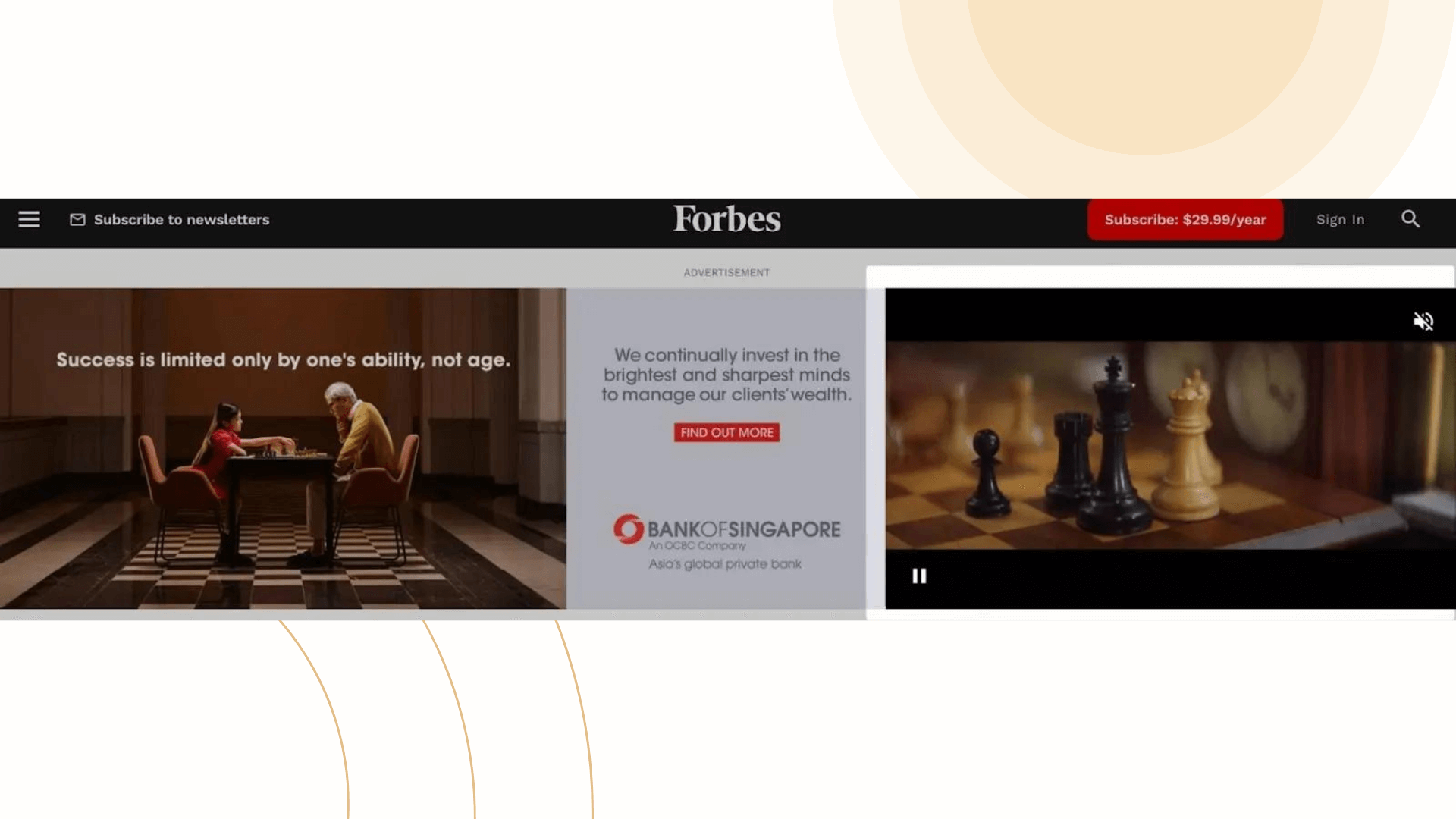
Bank of Singapore effectively utilizes video display ads to engage its target audience and promote its wealth management products. These moving ads are strategically designed to capture attention and deliver detailed narratives, enhancing the brand’s storytelling capabilities.
Reasons for success:
- Tap in the right demand: According to the Wyzowl survey, there is a high demand for video content among online consumers, with 91% expressing a desire to see more videos from brands. This data underscores the effectiveness of video display ads in driving engagement and conversions.
- Engaging storytelling: Bank of Singapore’s video ads incorporate visuals and sound to create compelling narratives that resonate with their audience. By showcasing real people or products in action, these ads aim to captivate viewers and hold their attention longer, conveying the brand’s message effectively.
- Strategic placement in relevant sections: The placement of Bank of Singapore’s video ad in Forbes’ ‘Money’ section targets users who are likely interested in wealth management products. This strategic placement ensures that the ad reaches a qualified audience interested in the services offered by the bank, increasing the chances of engagement and conversions.
Merrell
Merrell, a renowned footwear brand, takes a unique approach in its advertising by showcasing its shoes in a natural forest setting rather than the typical blank background. This strategy resonates with outdoor enthusiasts and adventure seekers, evoking a sense of longing to explore the great outdoors.

Reasons for success:
- Captivating visuals in a natural setting: Merrell’s decision to feature its shoes amidst trees, green grass, and leaves creates a visually appealing ad that captures the essence of hiking and outdoor adventures. This approach stands out from traditional shoe ads and appeals directly to their target audience interested in outdoor activities.
- Emotional connection to the experience: By focusing on the hiking experience rather than just the product, Merrell’s ad establishes an emotional connection with viewers. It taps into the desire for adventure and exploration, enticing customers to imagine themselves hiking and enjoying nature, which can lead to a stronger desire to purchase hiking boots.
Lexus
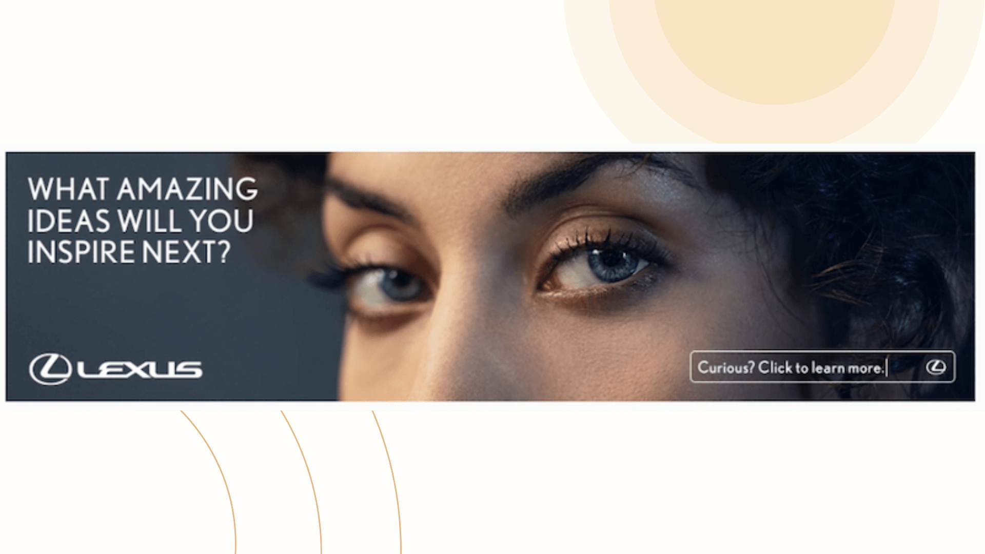
Lexus, a luxury automotive brand, employs a unique marketing strategy to promote its latest innovation—the new speaker system in the Lexus ES. Rather than directly marketing the car, Lexus focuses on showcasing its innovative features to capture the attention of its audience.
Reasons for success:
- Indirect marketing approach: Instead of showcasing car specs and features upfront, Lexus takes an indirect approach by highlighting the human sense of hearing and sound design. This strategy aligns with the innovative nature of the brand and positions Lexus as a leader in automotive technology.
- Integrated marketing campaign: The ad seamlessly connects with a dedicated landing page featuring a video that delves deeper into the sound experience of the new speaker system. This integrated approach ensures continuity and reinforces the brand’s image as an innovator in the automotive industry.
- Cementing brand image: By focusing on innovation and cutting-edge technology, Lexus strengthens its brand image and perception among consumers. The ad and accompanying content work together to create a lasting impression of Lexus as a brand that prioritizes advancements and superior experiences for its customers.
Tips for crafting compelling Google Display ads
Now you’ve seen a variety of excellent Google Display Ads examples. Can you find a common ground between them? If not, we’re here to help out! Here are some tips we’ve gathered for you to make a wonderful image-based ad to drive more sales. In case you have taken all steps but rarely seen the result, we also supply you with ways to optimize your Google Display Ads. :
- Grabbing customers’ attention: Attracting customer attention is the key to kickstarting sales for your business. Don’t overlook this important step! Use things like big pictures or important facts to make sure people remember your ad. This will help your ad stick in their minds.
- Including your brand logo: Putting your brand logo where people can easily see it is really important. Although it may appear insignificant, it assists in imprinting your company’s name in people’s memory after they view your ad. This aids in enhancing brand recall.
- Imaginary matters: Using nice pictures in your ad is super important! Eye-catching images attract people’s attention, influencing their reaction to your ad because people are drawn to appealing visuals. This can significantly impact their response.
- Presenting an effective CTA button: And lastly, make sure your “Click Here” button is really good. Use bright colors and words that make people want to click it. This is your final chance to get people interested, so make it count!
When you’re running Google Display Ads, it’s super important to track how well they’re doing. NestAds is here to help you with your ad ranging from your customer journey tracking to performance reports. Try NestAds now to see your ad leveraged!


